This project was for my UI/UX Career Track Certification for Springboard. I was given a problem and was challenged to create a mobile solution for a subscription cutting website.
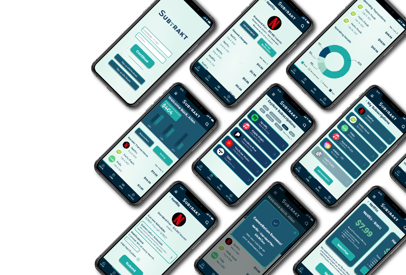
UX Researcher, UI/UX Designer, Information Architect, Usability Tester, and Visual Designer
Subtrakt was a tracking application that helps users manage their subscriptions to help reduce needless spending. Initially their product only launched a desktop site that is not mobile friendly. They were looking to broaden their existing audience by providing a mobile app, that can be easily accessible from anywhere and on the go.
CONSTRAINTS - Mobile application.
A mobile all access subscription hub that allows users to quickly track and manage their subscriptions, featuring subscription timing, management, and adding more subscriptions.
Expand user base by offering a mobile extension of existing website, to help user reduce needless spending.
Identify user needs and wants on how they manage their spending when it comes to subscriptions.
Questions:
1. How many subscriptions do you currently have?
2. How do you currently manage your subscriptions?
3. How much time do you currently spend tracking your
subscriptions?
4. Do you use anything to manage your spending?
My method was to ask around to get familiarized with how people keep track of their subscriptions. I interviewed 5 users to get insight on how people tracked their spending.
60% of users interviewed had around 4-5 subscriptions and while they are budget conscious, did not actively track spending.
∙ Hypothesis - User rarely notices how their subscriptions spending effects them.
∙ 80% of users has heard of subscription tracking applications yet does not use them.
Users also spend less than 5-10 minutes reviewing their subscription spending.
∙ Users do not really make an effort to view their spending on subscription based items or apps.
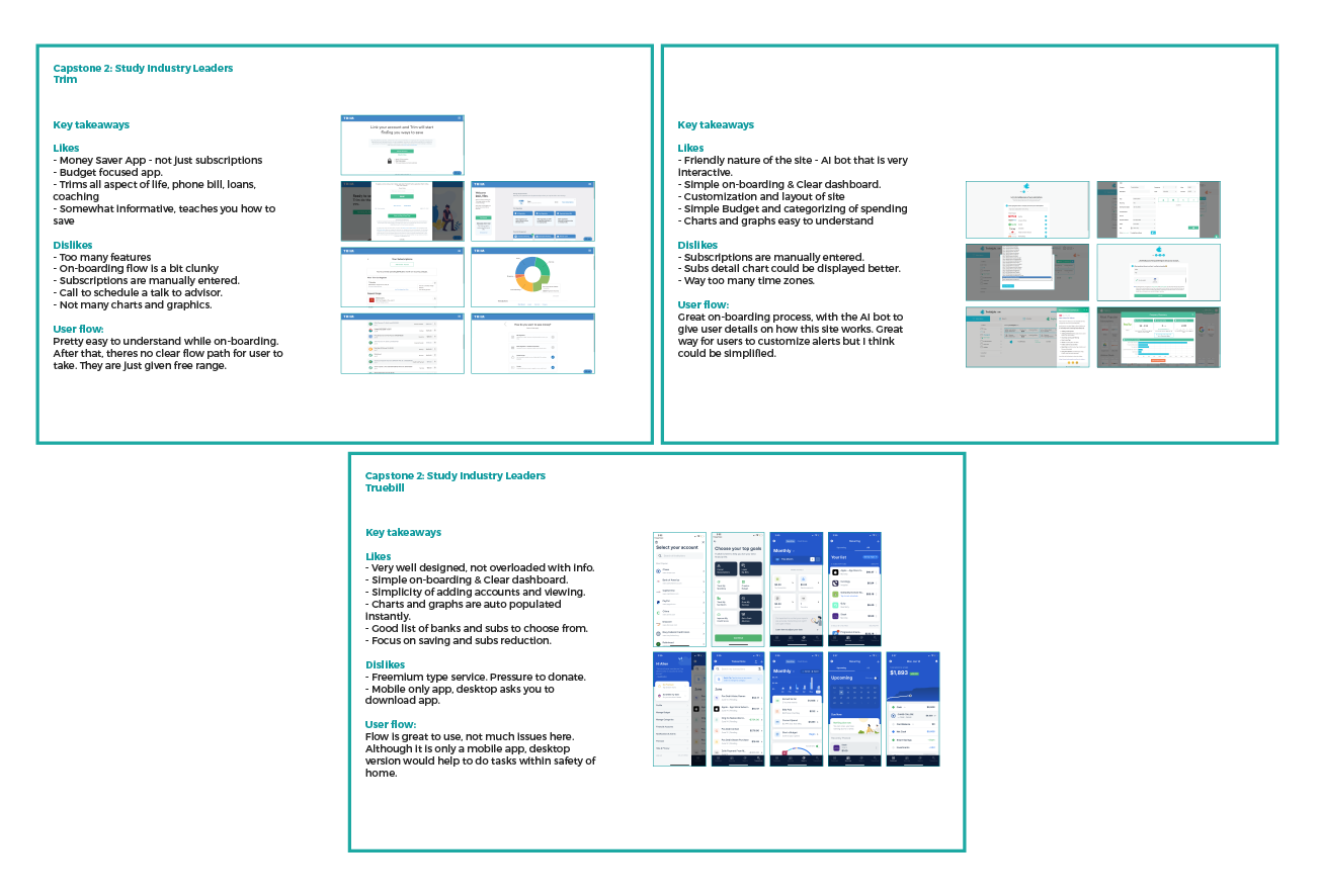
I determined that competitive research was most effective for Subtrakt. I explored competitors such as Trackmysubs, Trim, and Truebill. I also took a brief look at Mint to get an idea of how other subscription apps worked.
I found out that none of my competitors were subscription cutting apps. Although that feature was offered to me, all I felt was that it was a budget app. I downloaded all of these competitor apps, went through their on-boarding process, linked my account and analyzed each app to see what made it successful and what didn’t.
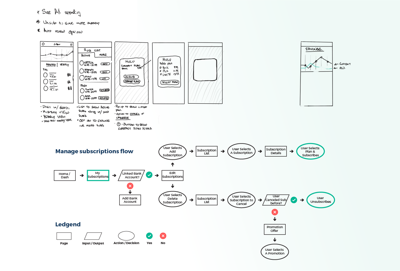
I started with a rough sketch to get some ideas going, but I then jumped right into user flows to determine how users will navigate through Subtrakt.
I first need to understand the information architecture of the site. It helps me the most to define the layout as a map, to further guide my design choices. I moved on to wire-framing shortly after that. I did this because since most of my testers I had lined up were virtual meetings, Figma’s shareable prototype helps out tremendously.
Being new to Figma and not having much experience I found that there were a lot of helpful assets that are available on-line. I landed on a wire-framing kit that had everything I needed, from pie charts to calendar scheduling. I used Realvjy’s Bloo Lo-Fi kit that helped me quickly wire-frame, prototype, and test out my designs.
In total, I tested 5 users to confirm if my design choices were effectively conveying my idea. The feedback I got was a bit surprising.
1 - Cancel subscription was too easy to click on and mistakenly cancel something that the user wanted to keep.
2 - Graph was misleading and 80% of users asked how it would function.
3 - 80% of users felt that the notification feature were too limiting.
4 - 60% of users tested liked the promotion feature when canceling a subscription.
5 - All users mentioned that the notifications button was misplaced and did not belong on the home page.
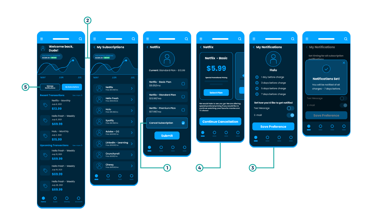
Overall users understood the concept of the features on Subtrakt. Users stated that the app was clear and flowed naturally.
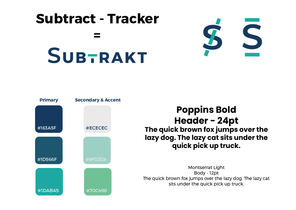
Gaining better insight through my first round of user testing. I started to define Subtrakt’s branding and style guide.
A trusted friend who is here to help you save money.
Trustworthy
Caring
Friendly
Casual
Given the personality and attributes of the brand I established the guidelines for Subtrakt. I decided on the name Subtrakt since play on words are very catchy and goes well with the company’s objective, to help users take back control of their spending.
I spent some time on attempting to create a word mark for the brand but decided against it. The kept the logo as a full word to maintain consistency within the brand.
I applied the branding guidelines onto my wire-frames to create a prototype with the look and feel of a real working mobile app.
Aside from the feature of tracking and managing user subscriptions, I added in a promotional pricing page to help the user save money if they aren’t willing to part with their subscription. This was an idea that came to mind as I was sketching. I was thinking more about how companies usually entice you to stay with them a bit longer. If anyone has canceled a Sirius XM subscription you should know, they will call you every month to ask you to resubscribe. This was just a hypothesis, but I figured it couldn’t hurt to test it out.
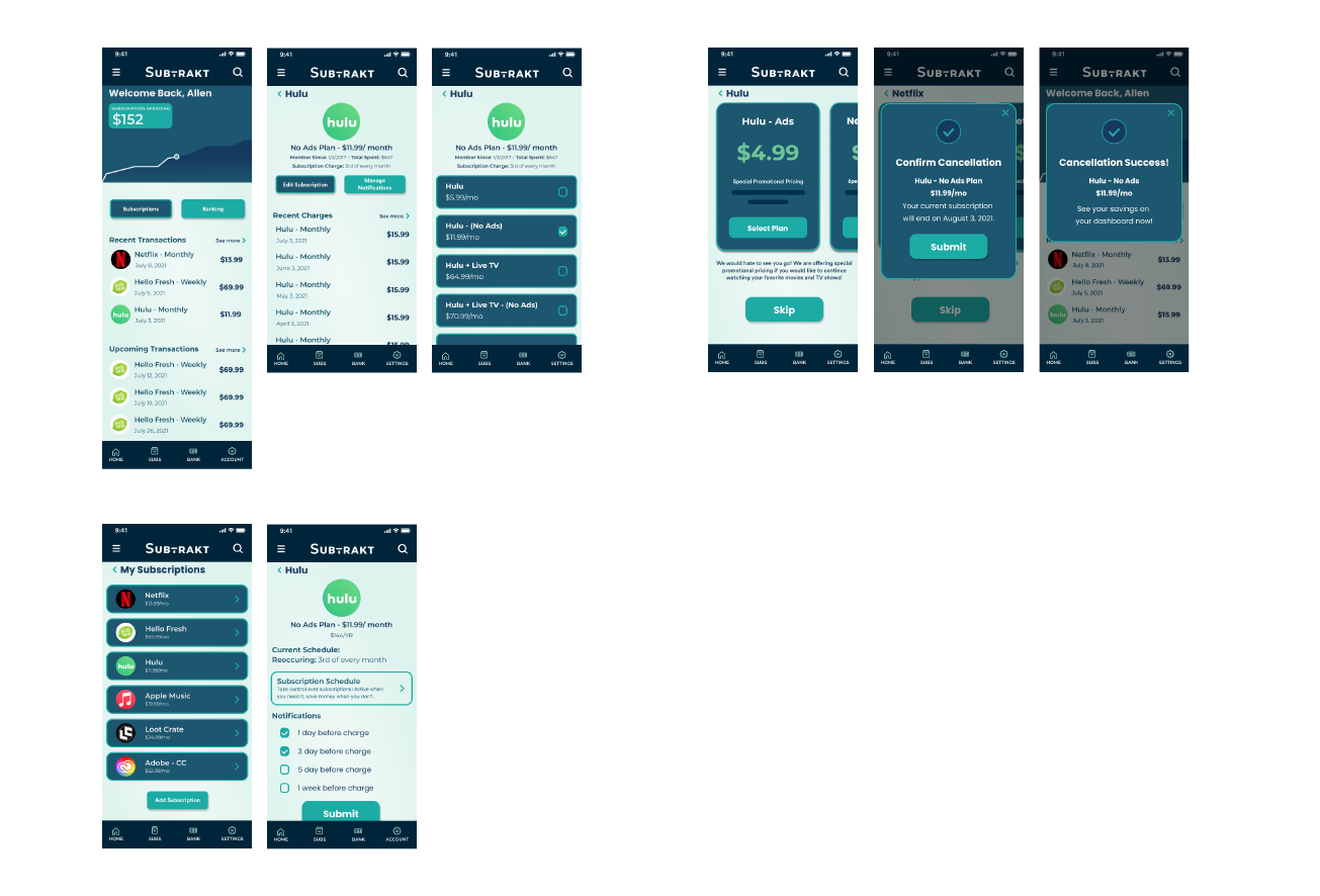
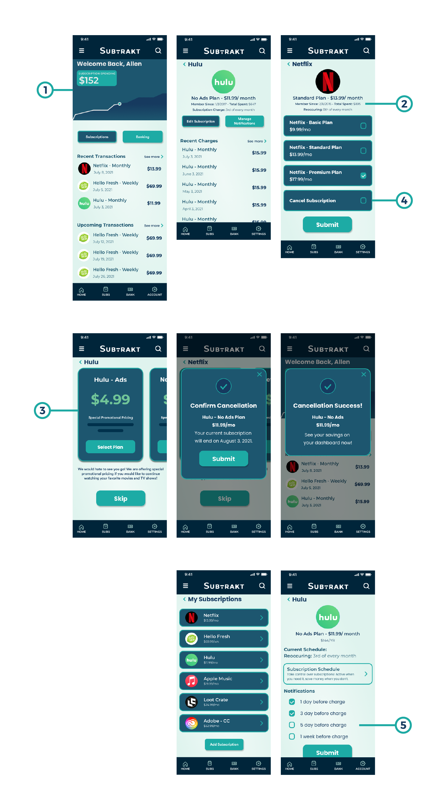
I tested my prototype on 4 users, 3 of them were virtual tests. Users were given a quick brief of the mobile app and a list of tasks to complete.
∙ Canceling a subscription.
∙ Managing their notifications
∙ Tracking their subscription spending.
∙ Browse through other subscriptions to compare.
I kept the interview very casual with the tasks not being overly specific. I wanted to really see where users were navigating to and how they perceived the app. Most users had an easy experience with the app with some minor problems.
INSIGHTS
1 - 60% of users enjoyed the visual of the graphs but mentioned that subscriptions do not always increase like how the graph was displayed.
2 - 75% of users liked the information displayed on the subscription page, it helped users get an idea of their overall spending.
3 - 50% of user that liked the promotion feature versus users that did not like it.
4 - Cancel subscription button was too similar to the change their subscription button and was either overlooked or clicked too easily.
5 - 75% of users felt that the notification settings were good, yet still not fully pleased with it.
Given the feedback from 2 rounds of user testing. I implemented changes based on priority of importance, ranging from critical, major, minor, and normal issues.
1 - It now shows a bar graph of the current month and past 2 months of subscription usage. A second bar to shows previous year ’s spending.
2 - Subscription cancellation is no longer a button / check box. Shows a link that takes user to cancellation screen.
3 - Notifications changed to a drop down selection to give user more control on when they’d be notified of any charges. This also includes option to set more than 1 notification.
4 - Included a feature that allowed users to set a schedule of how long to hold onto a subscription. This was a discovery found through the 2nd round of testing.
5 - Revised “My Subscription” page to show inactive subscriptions for users to quickly jump back if needed.
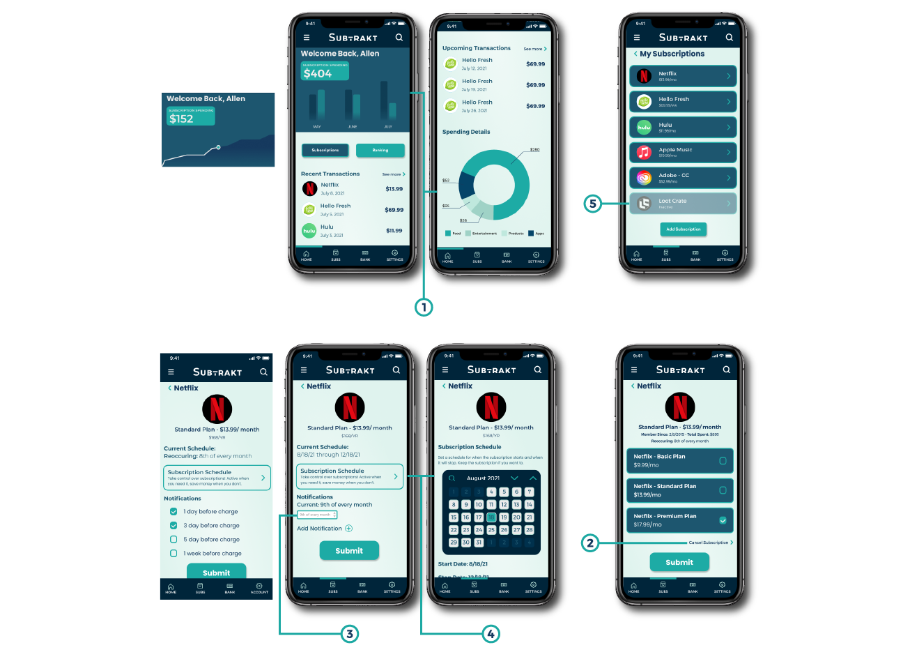
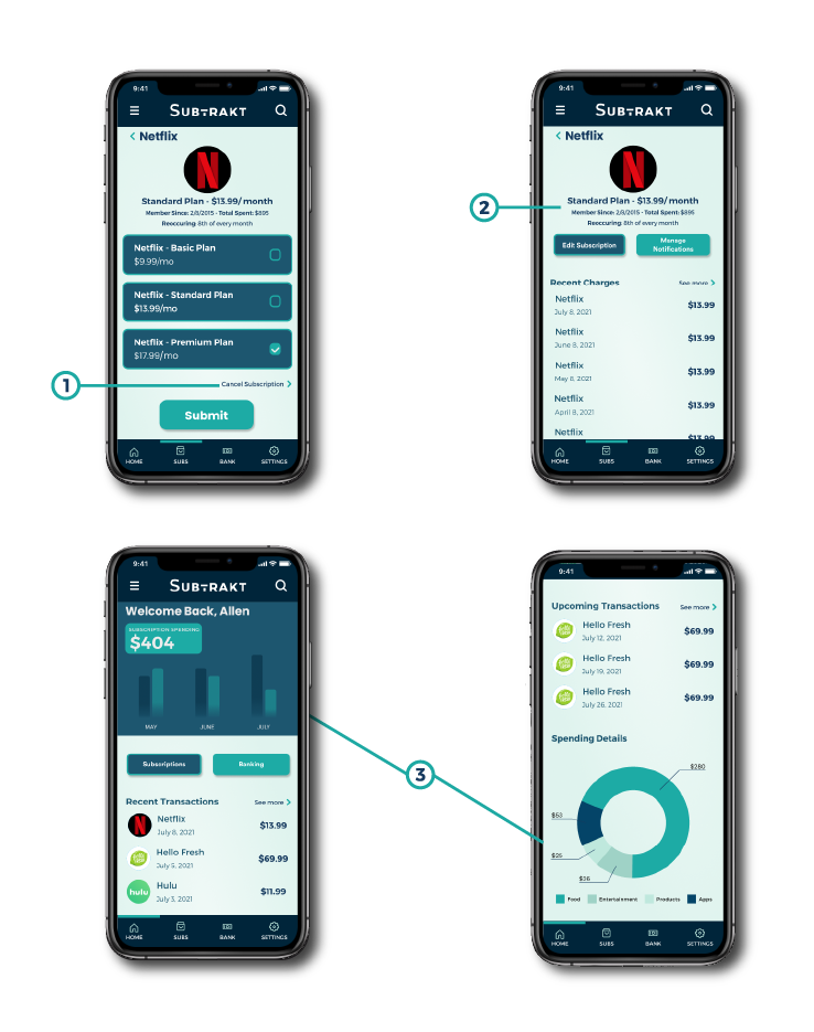
I reiterated my designs along with adding some extra features to better improve the overall experience of subscription tracking. I retested 5 users over the phone, 1 in person, and used Figma’s sharing feature to see how users navigate through Subtrakt.
FINDINGS
1 - 16% of users did not notice the cancel button. Effectively reducing users from accidentally clicking.
2 - 40% of users stated that there was some confusion on price of overall spending on each subscription. Since I started? Since this year?
3 - Users wanted to see pricing on their subscription pages to get better picture of how each subscription is affecting them. Graph was not enough.
CONCLUSION
Effective UX design is not just effectively hitting user goals and solving pain points. It has to not only maintain design standards, but to also include information that users expect to see in a clear and concise manner.
This project was a huge learning experience for me. From user recognition on what they have experienced in the past, to color choices of a single button. All these design choices cumulate as a whole that makes up UX design.
My focus for this project was not only to learn a new application to design on. Also I realized that different apps and the one I created can be very similar but also feel vastly different. I wanted Subtrakt to feel similar to my competitors but also stand out by not creating a banking portion of the app. Maybe my focus was a bit too narrow in the long run but overall it effectively solves my problem. Helping people save money by creating a application that works well in helping people cut down on their subscription spending.
