Great Expectations (GX) is a data quality web application that helps businesses create flexible rules and apply their industry expertise as Expectations (tests) for their data. Initially started out as a open source tool, GX quickly grew to become one of the fastest growing tool used by data practitioners.
Product Design, UX Research, Visual Design
Users that were testing GX Cloud needed to know what the current state of their datasets looked like to know which set of rules to best apply. A data dictionary was a very high requests to both inform users of the current state and areas of concern they should be aware of. This would provide a snapshot of their datasets to better understand and apply the right tests to their data.
Create a dashboard view into the data and have an understandable snapshot view of the data that was added onto GX Cloud. Over 65% of users interviewed mentioned a desire to have a view similar to our Data Docs or view of all data to better grasp the overall status of the many datasets that needed testing.
We needed to understand the business impact of offering this feature. Due to the sensitive nature of data, we were limited in the following:
We need to first understand where in the user flow would be the best and ideal place to populate a visual dashboard. Using our existing User Journey Map and came to the conclusion the most ideal place was after users had connected to a datasource. GX Cloud would then quickly process the data and users would see a data dashboard to be able to get a snapshot view of their data in its current state.
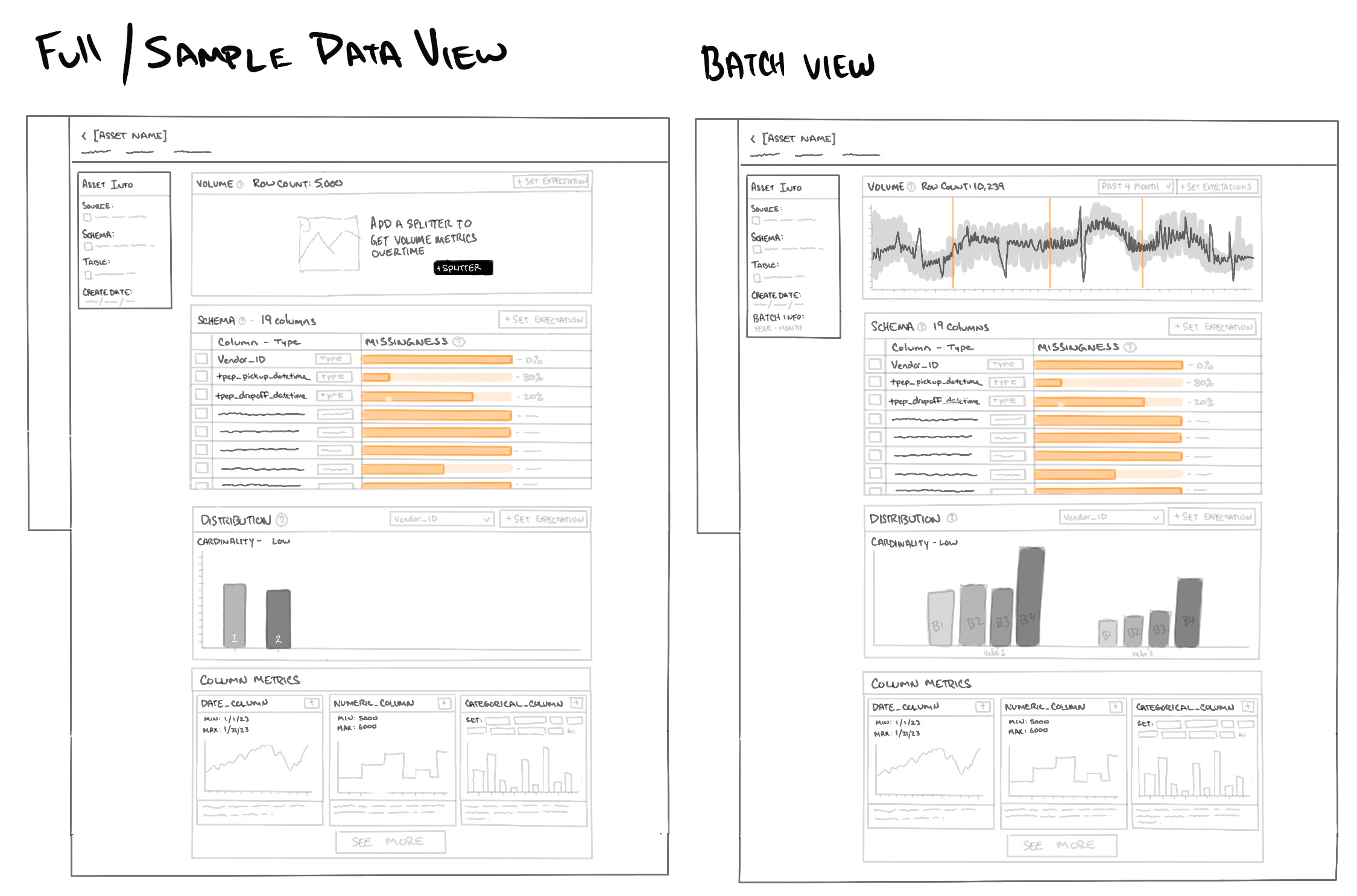
Our team decision was to make a lightweight dashboard, we opted to offer simplistic visuals like tables, graphs that surfaced the same information users loved seeing within OSS Data Docs.
Designing the prototype was quick and simple, using our Ant Design System for Figma we were able to quickly pull together a simple, but very detailed prototype. We used out of the box components instead of custom components as they were easier to implement. A few components needed to be "detached" to meet some of our needs.
Discussion and iterations with the product team finalized the nessecary requirements and questions we wanted to ask users. We felt that it was ready to take back to our customers for feedback. We focused on 3 main topics.
Since we were returning to the users we had spoken with previously we did not create a new scenario for users but opted to gain better understanding using the following tasks. Interviews were led by a Project manager, 2 Engineers and myself.
The scenario was set to when users had successfully connected to their datasource:
Overall the feedback from users were generally positive. Visual aspect was helpful, but new pain points and needs were surfaced. From the interviews we extracted the following:
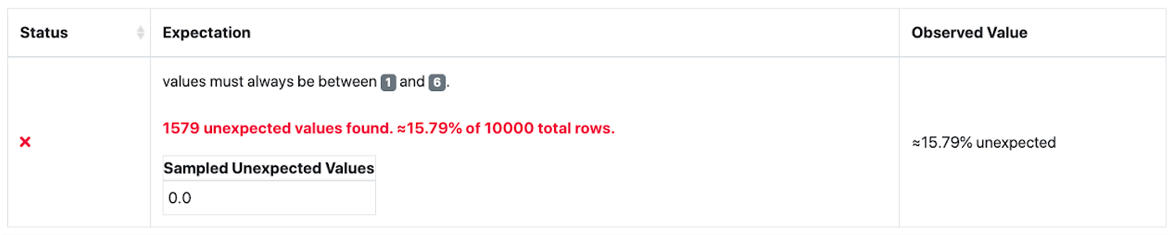
Users that were familiar with GX OSS were able to access a feature called profiling. Users were able to apply a larger amount of Expectations to the whole table, but the issue was that it provided too many various base Expectations and created a large amount of clutter and unnecessary Expectations.
You can press "Z" to change the scale of the prototype.
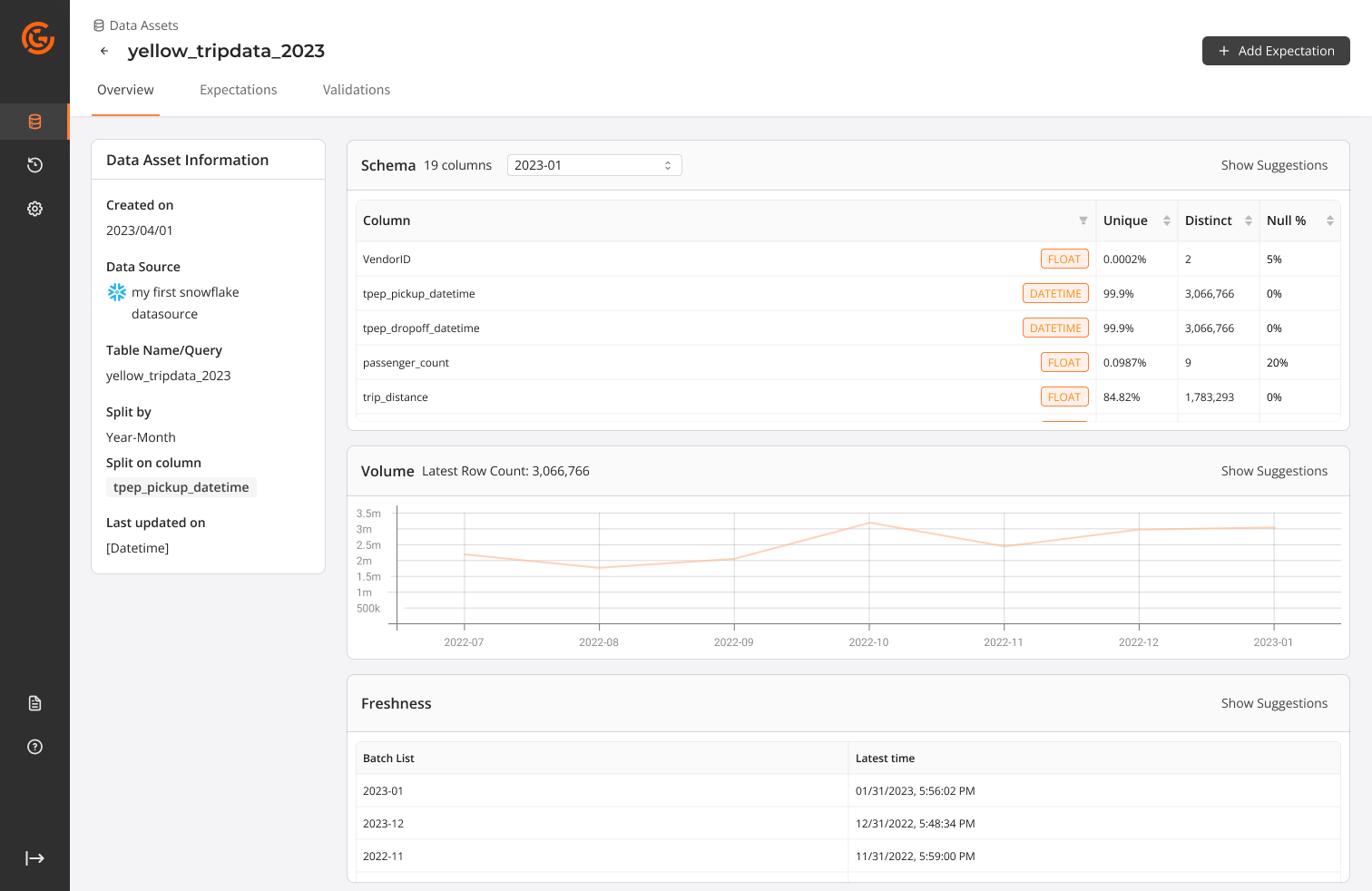
We learned a lot from the feedback users had given us. Over 50% of users expressed interest in having this view but during our discussion uncovered a more pressing issue. Users wanted to set up basic tests that covered their needs and needed an ability to repeat this process across a large number of datasets. We successfully shipped a portion of the dashboard view with a simplified table capturing basic schema information, null%, min-max ranges. This helped provide users with the most bare bones needs without the bells and whistles of graphs.
We then pivoted to allowing users to leverage AI to analyze users data and then recommending basic Expectations to quickly get set up and running. We worked on allowing users to simply select from a list of data quality issues that we have identified and allowing users to select which Expectations they would like GX Cloud app to created as a foundation and then allowing users to refine and tune to their needs.
This feature release, even though quite small, successfully improved completion rate by 30% and reduced drop offs by 46%. We offered users an option to select automatic profiling of their data and applied 2-5 Expectations that would be generated to give users a foundation to continue on their data quality journey.